


ProjectCodeMeter
Analysis Results Charts
Charts visualize the data which already exists in the Summary and Report Files.
They are only displayed when the analysis process finishes and valid
results for the entire project have been obtained. Stopping the
analysis prematurely will prevent showing the charts and summary.
Minute Bar Graph
Shows the measured WMFP metrics for the entire project. Useful for visualizing the amount of time spent by the developer on each metric type. Result are shown in whole minutes, with optional added single letter suffix: K for thousands, M for Millions. Note that large numbers are rounded when M or K suffixed.
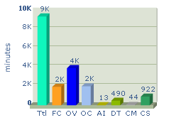
In
the example image above, the Ttl (Total Project Development Time in
minutes) indicates 9K, meaning 9000-9999 minutes. The DT (Data Transfer
Development Time) indicates 490, meaning 490 minutes were spent on
developing Data Transfer code.
Percentage Pie Chart
Shows the measured WMFP metrics for the entire project. Useful
for visualizing the development time and cost distribution according to
each metric type, as well as give an indication to the nature of the
project by noticing the dominant metric percentages, as more
mathematically oriented (AI), decision oriented (FC) or data I/O oriented (DT and OV).
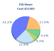
In
the example image above, the OV (dark blue) is very high, DT (light green) is nominal, FC (orange) is typically low, while AI
(yellow) is not indicated since it is below 1%. This indicates the
project nature to be Data oriented, with relatively low complexity.
Component Percentage Bar Graph
Shows the development effort percentage for each component relatively to the entire project, as computed by the APPW model. Useful for visualizing
the development time and cost distribution according to the 3 major
development components: Coding, Debugging, and Testing.
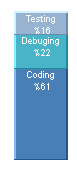
In
the example image above, the major part of the development time and cost was spent on Coding (61%).